Web Post Conversations
July 13, 2023 - Post conversations in Honeycommb’s web application gets a major upgrade in both the experience of posting and viewing comments & replies and in features.
The primary experience for most members of Honeycommb networks is the conversation that happens on a piece of content. Commenting and replying to a post, along with following along in the conversation happening on a post by reading members comments and replies, are by far the most used and interacted-with interfaces in each network.
The experience of using these interfaces in Honeycommb’s web application, in both desktop and mobile browsers, takes a big leap forward to promote engagement and enjoyment for Honeycommb network members which is exactly what our Honeycommb network owners want.
COMMENT / REPLY INPUT
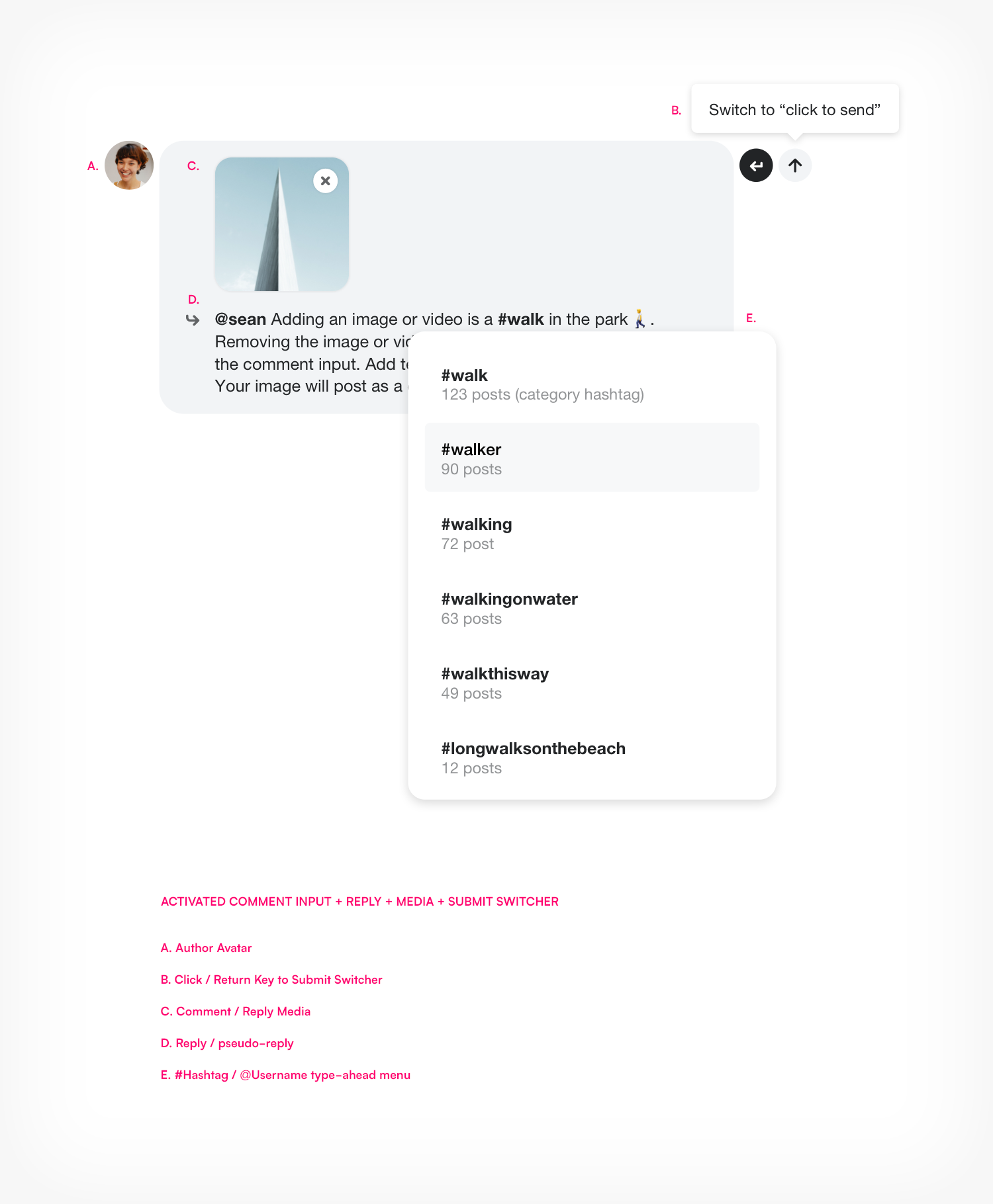
The web post comment input has been completely redesigned. Not only is it beautiful and easy to use, for a small component - it’s packed with a lot of features. This might be best illustrated in the following graphic (feel free to download the graphic to share with your members).
Design
The design of the comment input element may seem simple at first glance but it’s a complex piece of software that responds elegantly to the many use cases it requires. The avatar and shape of the input mimic the read view of comments and replies, making the transition from input to view more natural and easily understood.
The comment input’s placement has changed to always be accessible at the bottom of the viewport when viewing a post. This promotes engagement and better use by allowing members to scroll through and read post comments while still being able edit their comment or reply in the comment field.
Members “activate” the input simply by clicking into the comment input field. This will illuminate the field and allow for text input. Note that activating the field is not required to click the media button to add an image or a video. The comment field grows with the amount of text and media added to the input. Click or Return key to post are options a member can easily switch between.
Adding Media

Improving the comment / reply experience was initially prioritized to add this capability; to select, upload, and view media as a comment or reply. Clicking the media button on the right side of the comment input component will bring up your computer’s file menu to allow for you to select a single image or video media file.
Selecting a file will begin uploading and transcoding the media immediately to reduce the wait time to post the comment or reply.
Because only a single media file can be uploaded as a comment or reply, the add media button is removed from the comment field once a media file is selected. The media file can be removed by clicking the “x” icon over the media. Once the media file is removed, the add media button will be available.
Image file types: jpg, gif (including animated gifs), png, and svg
Video file types: mov, mp4
Comment / Reply / Pseudo-repply
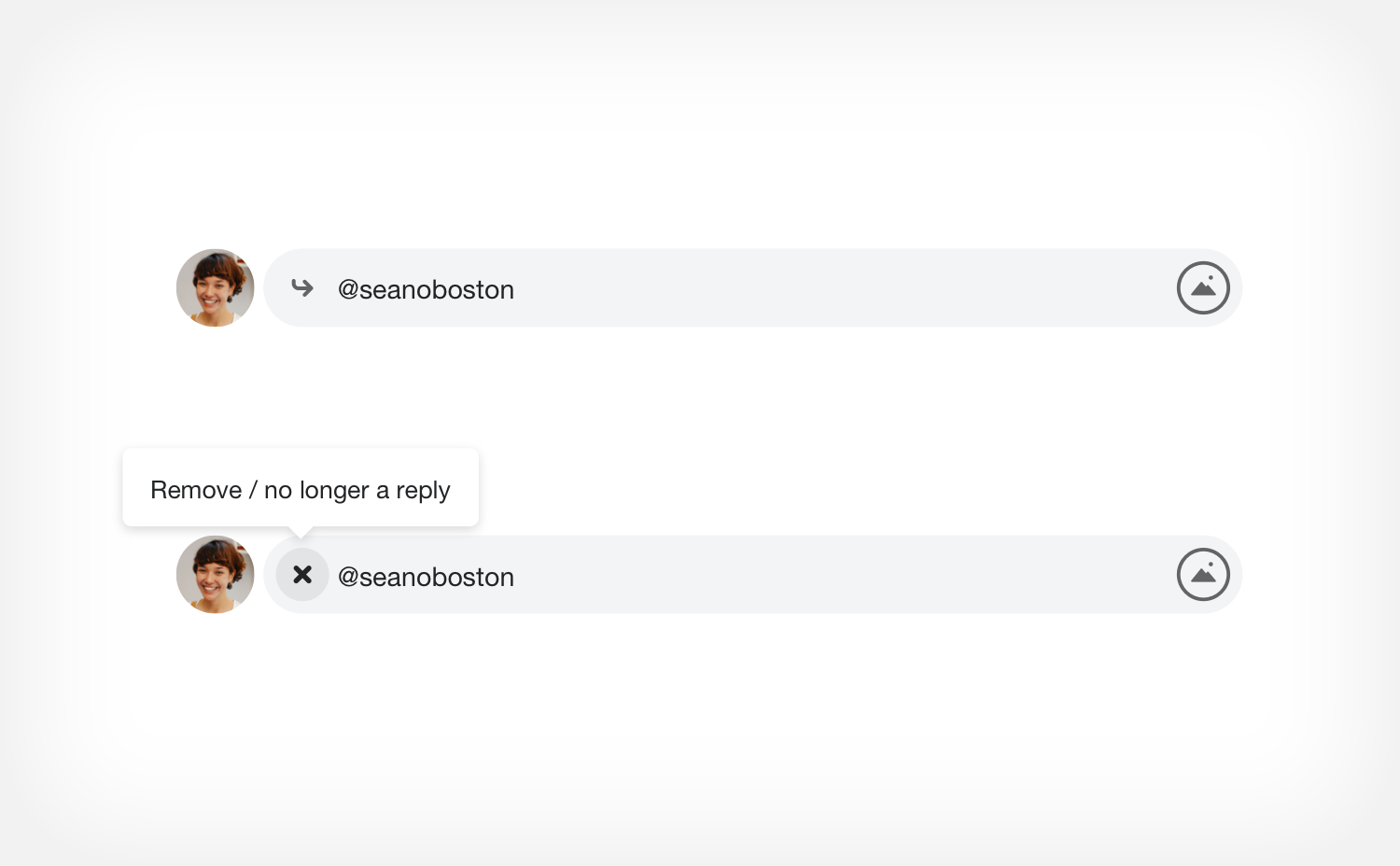
The input is used to comment on a post, to reply to comments on a post, and to pseudo-reply to a reply by using the “Mention” action found on a reply to a comment on a post. When using the Reply or Mention feature, a reply icon and the @handle of the member that is being replied to or mentioned will appear in the left side of the comment input. This Reply or Mention can be removed by clicking on the “x” icon that replaces the reply icon on mouse hover. Removing the reply/mention will make any submitted text or media a post comment.
Click / Return Key to Submit Switcher
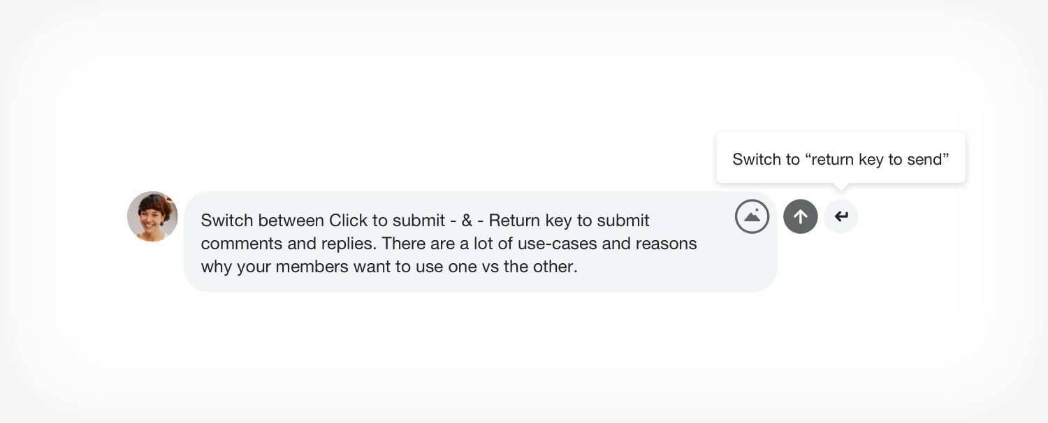
We want to make engaging with content in your networks as simple and enjoyable as possible as it’s the primary form of engagement. The reasons for your members wanting to use the click to submit button vs the return key to submit a comment or reply are many so making this functionality available was necessary. The difficulty was adding the feature in an elegant way that didn’t add distraction to the interface.
To switch from “click to submit” to “return key to submit”, simply hover over the submit button in either state. After a 1 second delay, the ability to switch to the other submit option will become available.
Since this feature is a little hidden, you may want to educate your members on how this works. Feel free to download and use the imagery below when illustrating the functionality in your network.
#Hashtag and @Username Menus
Member can initiate the hashtag and username menus simply by using the key “#” for hashtag, and “@” for usernames.
Usernames - Members can add usernames to their comments, either naturally by using the “reply” or “mention” feature associated with comments and replies or simply by using the @ key which will bring up a type-ahead filtered menu of available usernames to select from.
Hashtags - Much like with Twitter, hashtags offer a folksonomy capability that allows network members to organize content in their network by adding hashtags to their content. Members can use hashtags anywhere in their comment or reply to organize their response around the hashtag.
CONVERSATION VIEW
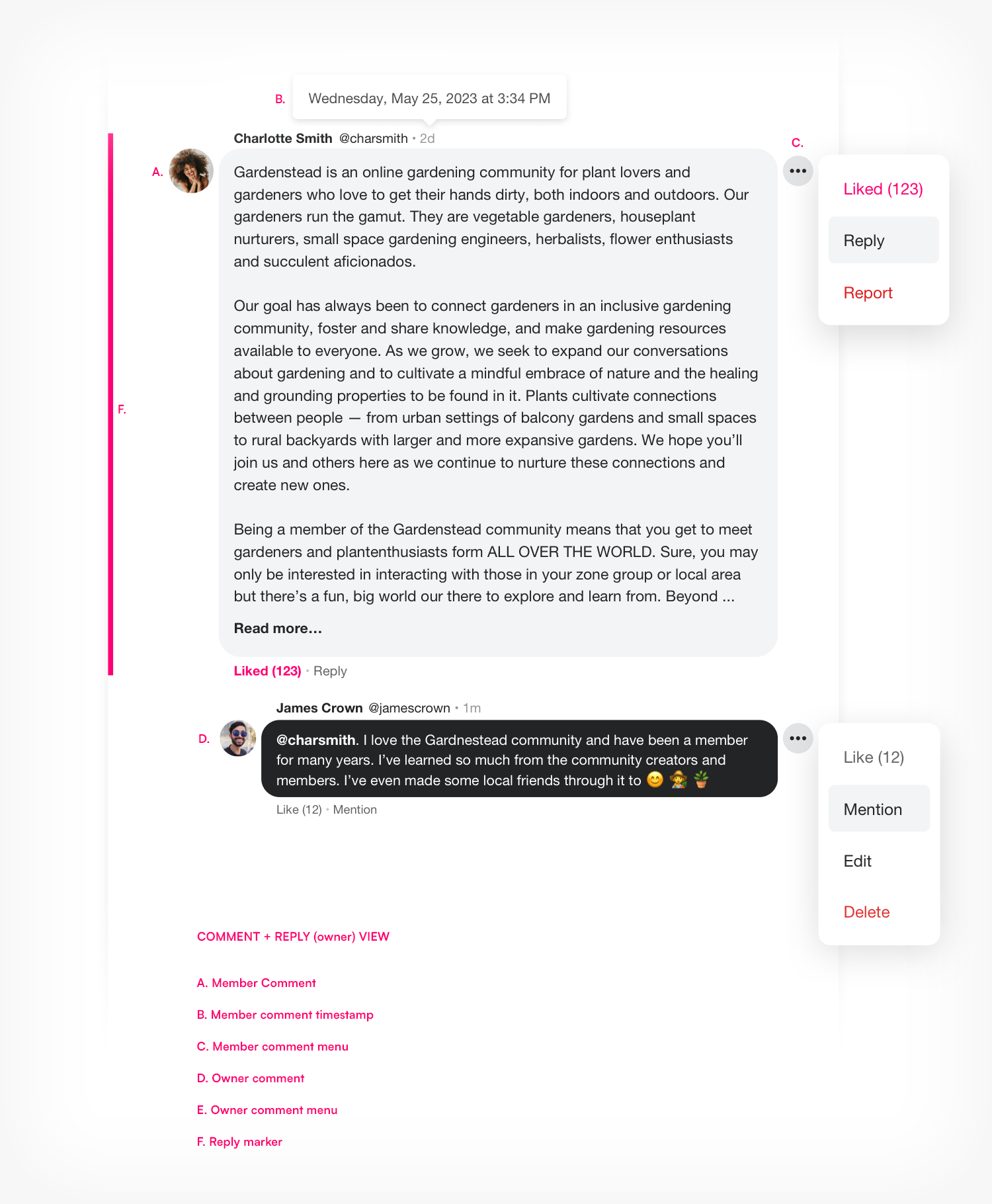
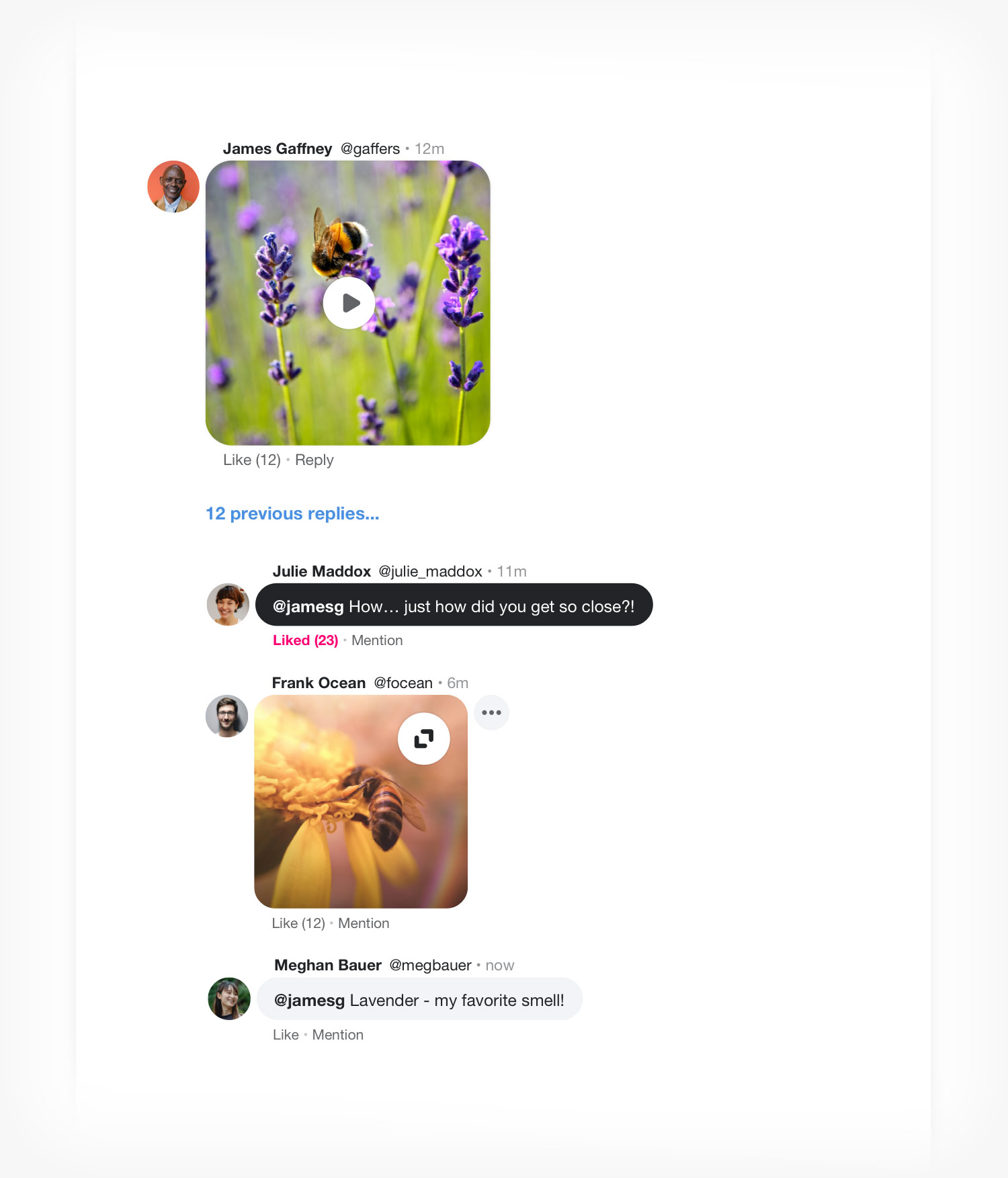
The comment and threaded comment with replies view has been redesigned to promote more chat-like engagement, improved readability, media support, and other functional support like edit, like, reply/mention, delete, and report. A few other major improvements are focused on being able to find your comments and a visual indication to be able to find and focus on a comment or reply that a member is replying to. Once again, this may be best illustrated using a graphic (see below).
Design
The design follows an update to our Direct Messaging redesign, is more indicative of modern social networks, and promotes engagement by creating a visual representation that feels somewhat like text messaging, a more casual and friendly experience.
Like modern messaging, the design calls attention to the author’s comments and replies by displaying them with white text in a black background where the comments and replies of other’s are displayed as black text on a light-gray background. This makes finding one’s own comments and replies more effortless so that they may more easily follow along in the conversation they’re having on a post.
Replies / Mentions
Replies are threaded “under” comments (with indentation) where the first reply is shown at the top and latest reply is shown at the bottom. When there is more than three replies on a comment, the replies are “collapsed” with the three latest replies shown, and a “# previous replies…” link becomes available to load the other previous replies.
“Mention” exists as a pseudo-reply to a reply, since post conversations only have two levels; 1. Comment, 2. Reply (you can’t reply to a reply). To pseudo-reply to a reply on a comment, members use the “Mention” feature, which adds the reply author's username in the comment field. The mention will then be posted in the reply thread in time delineated order with the other replies.
When replying to a comment or pseudo-replying via the “Mention” action, members will find a “reply marker”, a vertical accent color bar (uses the communities accent color) placed alongside the comment or reply being replyied to. This is especially helpful when using the “reply” action associated with an activity in a member's “Activities” area.
Avatar, Author Name, Username, and Timestamp
Every comment and reply makes accessible its author’s Name and Username along with a short and detailed timestamp. Clicking on the author's avatar or username will direct you to their profile. Hovering over the short timestamp (ex. 3h) will display a detailed timestamp of exactly when the comment or reply was posted.
Media Viewing
When media is added to a comment it is represented as a comment or reply in the thread, again much like a messaging experience on mobile devices. Media is formatted in the original aspect ratio reduced in size for a viewing experience that doesn’t overtake the thread of comments and replies. Images can be expanded for a closer look. Videos can be played inline or can be viewed in full screen resolution.
Comment / Reply Menu Actions
Every comment or reply makes accessible “Like” and “Reply” or “Mention” actions. Every comment or reply makes also has an associated “•••” menu button that members can access for a set of actions based on whether the comment or reply is theirs or another members.
Author - Clicking on the ••• menu button for your own comment reply gives authors the ability to; Like, Reply / Mention, Edit, Delete.
Member - Clicking on the ••• menu button for other members comments or replies gives members the ability to; Like, Reply / Mention, Report.
This project for improving the Honeycommb Web App’s post conversation experience is months of work in design, engineering, testing, feedback, and refinement in the making. We expect the release of these improvements and new features to greatly improve engagement in your networks and the joy your members have interacting within it.
Sincerely,
The Honeycommb Product Team
Create Your Network
A powerful, full-featured administrative tool, the Honeycommb Control Center, is just one great reason to use Honeycommb to launch, grow, engage, and even earn revenue from a white-label social network that you own and control.
